
练习与作业1:基础做图 & ggplot2
用swiss数据做图
- 用直方图
histogram显示Catholic列的分布情况; - 用散点图显示
Eduction与Fertility的关系;将表示两者关系的线性公式、相关系数和p值画在图的空白处。
注:每种图提供基础做图函数和ggplot2两个版本!
```{r}
## 代码写这里,并运行;
require(tidyverse)
require(dplyr)
m=lm(Fertility ~ Education,swiss)
c = cor.test( swiss$Fertility, swiss$Education );
eq <- substitute(  atop(
  paste( italic(y), " = ", a + b %.% italic(x), sep = ""),
  paste( italic(r)^2, " = ", r2, ", ", italic(p)==pvalue, sep = "" )) ,
list(a = as.vector( format(coef(m)[1], digits = 2) ),
     b = as.vector( format(coef(m)[2], digits = 2) ),
     r2 = as.vector( format(summary(m)$r.squared, digits = 2) ),
     pvalue = as.vector( format( c$p.value , digits = 2))
     ))
eq <- as.character(as.expression(eq));
hist(swiss$Catholic)
ggplot(swiss,aes(x=Catholic)) +geom_histogram()
with(swiss,plot(Education,Fertility)) +text(35,85,expression(
  atop(
  paste( italic(y), " = ", 80 + -0.86 %.% italic(x), sep = ""),
  paste( italic(r)^2, " = ", 0.44, ", ", italic(p)==3.7e-07, sep = "" )) ))
ggplot(swiss,aes(x=Education,y=Fertility)) +geom_point()+
  geom_text(data=NULL,aes(x=35,y=85,label=eq,hjust=0,vjust=1),size=5,parse=T,
            inherit.aes = F)
```用iris作图
- 用散点图显示
Sepal.Length和Petal.Length之间的关系;按species为散点确定颜色,并画出 legend 以显示species对应的颜色; 如下图所示:
- 用 boxplot 显示
species之间Sepal.Length的分布情况;
注:每种图提供基础做图函数和ggplot2两个版本!
```{r}
## 代码写这里,并运行;
with(iris,plot(Sepal.Length,Petal.Length,pch=20,col=factor(Species)))
legend("topleft",  c("setosa","versicolor","virginica"), pch=20,
       col=c("black","red","green"))
ggplot(iris,aes(x=Sepal.Length,y=Petal.Length,colour=factor(Species)))+
  geom_point()+labs(colour=NULL)
boxplot(Sepal.Length~Species,data = iris)
ggplot( iris, aes(x=Species, y=Sepal.Length)) +
geom_boxplot()
```
用 ggplot 作图:boxplot
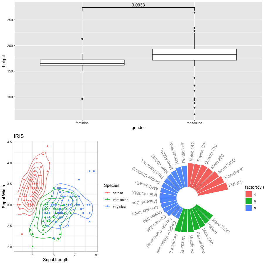
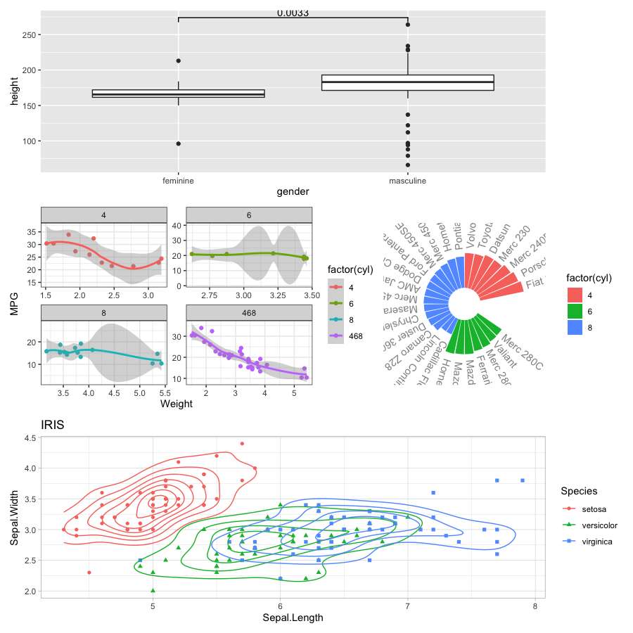
用 starwars 的数据作图,画 boxplot 显示身高 height 与性别 gender 的关系。要求:
height为NA的,不显示;- 用
ggsigif包计算feminine和masculine两种性别的身高是否有显著区别,并在图上显示。 - 将此图的结果保存为变量
p1,以备后面使用;
最终结果如图所示:

```{r}
## 代码写这里,并运行;
require(ggsignif)
starwars_r <- starwars[ !is.na(starwars$height), ];
starwars_r <- starwars_r[!is.na(starwars_r$gender),]
p1 <- ggplot(starwars_r,aes(x=gender,y=height))+
  geom_boxplot() + geom_signif(comparisons = list(c("feminine","masculine")),
                               map_signif_level = T)
p1
```
用 ggplot 作图:使用iris做图
用geom_density2d显示Sepal.Length和Sepal.Width之间的关系,同时以 Species 为分组,结果如图所示:
将此图的结果保存为变量 p2 ,以备后面使用;

```{r}
## 代码写这里,并运行;
p2 <- ggplot(iris,aes(x=Sepal.Length,y=Sepal.Width,colour=factor(Species),
                      shape=factor(Species)))+
  geom_density2d()+geom_point()+ggtitle("IRIS")+theme_minimal()
p2
```
用 ggplot 作图:facet
用 mtcars 作图,显示 wt 和 mpg 之间的关系,但用 cyl 将数据分组;见下图:
将此图的结果保存为变量 p3 ,以备后面使用

468 组为所有数据合在一起的结果。```{r}
## 代码写这里,并运行;
mtcars_r1 <- mtcars%>%select(wt,mpg,cyl)
mtcars_r2 <- mtcars%>%select(wt,mpg) %>% cbind(cyl=468)
mtcars_r <- rbind(mtcars_r1,mtcars_r2)
p3 <- ggplot( mtcars_r, aes( x = wt, y = mpg,color=factor(cyl) ) ) +
geom_point() +geom_smooth()+
theme()+
facet_wrap( . ~ cyl , ncol = 2, scales = "free")
p3
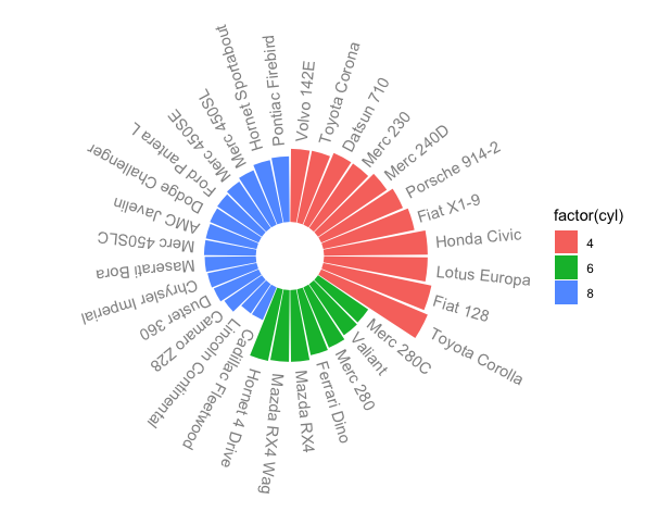
```用 ggplot 作图:用mtcars做polar图
用 mtcars 的 mpg 列做如下图,要求:先按 cyl 排序;每个cyl组内按 mpg排序; 将此图的结果保存为变量 p4 ,以备后面使用;
提示
- 先增加一列,用于保存 rowname :
mtcars %>% rownames_to_column()注: 将行名变为列,列名为rowname - 完成排序
- 更改 rowname 的 factor
- 计算每个 rowname 的旋转角度:
mutate( id = row_number(), angle = 90 - 360 * (id - 0.5) / n() )
```{r}
## 代码写这里,并运行;
mtcars_r3 <- mtcars %>% select(mpg,cyl)%>% rownames_to_column(var="rowname")
mtcars_r3 <- mtcars_r3%>%arrange(cyl,mpg)
label_data <- mtcars_r3
label_data <-   mtcars_r3%>% mutate( id = row_number(),
                                     angle = 90 - 360 * (id - 0.5) / n() )
mtcars_r3$id <- label_data$id
mtcars_r3$hjust<-ifelse( label_data$angle < -90, 1, 0)
mtcars_r3$angle <- label_data$angle
mtcars_r3$rowname <-factor(mtcars_r3$rowname,levels =mtcars_r3$rowname )
p4<-ggplot( mtcars_r3, aes(x=factor(rowname), y=mpg, fill=factor(cyl))) +
geom_bar(stat="identity", position=position_dodge())+
  theme(
    axis.text = element_blank(),
    axis.title = element_blank(),
     panel.grid = element_blank(),
    panel.background = element_rect(fill="white")
  ) +
  ylim(-10,50) +
 coord_polar(start = 0)+
  geom_text(data=mtcars_r3, aes(x=id, y=mpg+3, label=rowname,
                                hjust=0,vjust=0.5),
            color="black", alpha=0.6, size=2.5, angle= mtcars_r3$angle,
            inherit.aes = T )
p4
```
练习与作业2:多图组合,将多个图画在一起
用cowplot::ggdraw将 p1, p2和p3按下面的方式组合在一起
注:需要先安装 cowplot 包

## 代码写这里,并运行;
require(cowplot)
ggdraw()+draw_plot(p3, x=0, y=0, width=0.5, height = 1)+
draw_plot(p1, x=0.5, y=0.5, width = 0.5, height = 0.5)+
draw_plot(p2, x=0.5, y=0, width = 0.5, height = 0.5)+
draw_plot_label(label = c("A", "B", "C"), size = 15,
x=c(0, 0.5, 0.5), y=c(1, 1, 0.5))用gridExtra::grid.arrange()函数将 p1, p2, p4 按下面的方式组合在一起
注:需要安装 gridExtra 包;
```{r}
## 代码写这里,并运行;
require(gridExtra)
grid.arrange(p1,
arrangeGrob(p2, p4, ncol = 2),
nrow=2)
```用patchwork包中的相关函数将 p1, p2, p3, p4 按下面的方式组合在一起
注:需要安装 patchwork 包;
```{r}
## 代码写这里,并运行;
require(patchwork)
design1 <- "11
            34
            22"
p1 + p2 + p3 + p4 + plot_layout(design = design1)
```
练习与作业3:作图扩展
scatterplot
安装 lattice 包,并使用其 splom 函数作图:
lattice::splom( mtcars[c(1,3,4,5,6)] )
```{r}
## 代码写这里,并运行;
require(lattice)
splom( mtcars[c(1,3,4,5,6)] )
```
COMMENTS | NOTHING